A frequent question that publishers or bloggers have is, “How do I effectively and strategically create banner layouts that people actually want to click to maximize revenue?”
Let’s backtrack a bit. Google states that wider ad units typically work better than narrower ones. Whether it be a skyscraper, a rectangle, or even leaderboards, going with a wider ad unit makes it catchier and easier to read. Another selling point for wider units is that advertisers favor them for rich-media video campaigns, which increases competition between advertisers, which then turns into more bidding and of course, higher eCPMs. We recommend starting off by utilizing the wider ad units: 160×600 wide skyscraper, 300×250 medium rectangle, and 728×90 leaderboard.
Related Read: Where are the Best Placements for Banner Ads?
Now when it comes to placement, there are several reminders that we need to consider:
1) Think like a user
Always create the best user experience. How do I keep the page clutter-free? What interests my readers? How can I not annoy them while on the page?
2) Profile your readers
Know what interests them and place your ads close to the content.
3) Determine the first ad unit to use when running multiple units
Make sure that the most effective ad unit is the first unit that you plug in to your HTML codes.
4) Be straightforward
Don’t mislead your visitors when it comes to your ad units. A visitor should never think they’re clicking on a navigational link when they’re really clicking on an ad.
Related Read: Are Horizontal or Vertical Banners Better for your Website?
Considering these points, we have gathered several banner layouts that work best for websites:
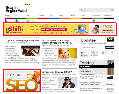
Above the Fold (ATF) Layout
On average, 80% of users’ time is spent above the fold, implying that a significant portion of users may not scroll down to view content located below the fold.

These are of course the ads that readers would inevitably first see. They may skim content that appears below the fold, but your better bet is to place your ad units in the space where your readers are already spending most of their time. However, for this design to be effective, always note that the content should be original and interesting. Conservatively, this is the best spot to maximize revenue. You can choose from these variations:
- Above the fold + right rail (e.g. reddit.com) – If your website is getting good traffic in the comments portion, you may also consider putting a narrow skyscraper way down the page, at the right side opposite the comments section.
- Above the fold request (e.g. people.com) – The request tickles the curiosity of visitors. You can have a 728×90 leaderboard and have it expand to 300×600 when requested. Chances are, this will beef up clicks — meaning better RPMs.
300×600 and 970×90 Ad Units Test these ad units on your website once in a while. They jump out of the page because they aren’t some of the more common units, and that will invite more clicks.
Can placing ads above the fold (ATF) impact viewability negatively in the context of lazy loading?
Yes, ATF ad placement can indeed interact with lazy loading practices in a way that might unexpectedly impact ad viewability. When ads are placed at very high ATF, and lazy loading is implemented, there’s a risk that these ads might not load immediately upon page load.
If content higher up on the page (including images, videos, or heavy scripts) is prioritized or if the user quickly scrolls past the ATF area, the ad might not have enough time to load and become viewable before the user moves on. This scenario can paradoxically reduce the viewability of ATF ads, which are traditionally valued for their high visibility and engagement potential.
How can publishers optimize ATF ad placement in combination with lazy loading?
Publishers can employ several strategies to optimize ATF ad placement while benefiting from lazy loading:
- Strategic Placement: Position ATF ads in spots where they are likely to be seen but not immediately at the very top. This could mean placing them slightly lower ATF, ensuring they have time to load as the user begins to engage with the page content.
- Prioritize Ad Loading: Configure lazy loading settings to prioritize the loading of ATF ads before less critical images or content further down the page. This ensures ads are ready and viewable by the time the user’s attention reaches them.
- Monitor Performance: Use analytics to monitor the viewability and performance of ATF ads in the context of lazy loading. Adjust placements and loading priorities based on real-world data to find the optimal balance between site speed and ad effectiveness.
- Engage with Ad Technology Providers: Work with ad technology providers that offer solutions specifically designed to enhance ad viewability in the context of lazy loading. Some providers offer advanced loading techniques or ad units that are optimized for these scenarios.
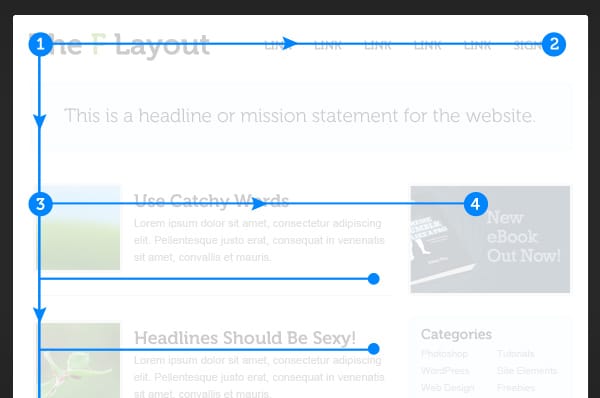
F-Pattern Placements

Notice that most of us read from top to bottom, left to right. This is a technique to use as you design your layout for relevant ads.
Ads Below the Content
This caters to readers who read through the entire site. You might want to check your statistics first and if you think they’re good enough, you may use this layout to pull readers toward your ads.
In-Image and In-View Ads

In-image and in-view ads are innovative advertising formats that have gained popularity due to their ability to blend seamlessly with web content, providing a non-intrusive user experience while effectively capturing user attention.
In-Image Ads
In-image ads are overlaid on relevant images within the content of a website. These ads are typically contextually targeted, meaning they are related to the image content or the article’s theme. For example, an ad for running shoes might appear on an image related to sports or fitness. This format is highly engaging because it leverages visual content that users are already interested in, making the ads less disruptive and more relevant.
In-image ads are particularly well-suited for publishers with rich visual content, such as lifestyle magazines, photography websites, and food blogs. These sites can offer advertisers highly engaging visual contexts for their ads, potentially leading to higher click-through rates and engagement levels compared to traditional banner ads.
In-View Ads
In-view ads, also known as “viewable” ads, are designed to appear in the visible area of the user’s browser window. They ensure that ads are only displayed when they have a high chance of being seen. This format addresses the challenge of ads being loaded but not viewed, either because they are placed below the fold or because the user quickly scrolls past them. In-view ads are charged based on viewability metrics, ensuring advertisers pay only for ads that users are likely to see.
This ad format is versatile and can benefit various publishers, especially those with content that encourages scrolling, such as news websites, forums, and blogs. By guaranteeing advertisers that their ads are seen by users, publishers can attract premium advertising rates and improve their inventory’s value.
Their suitability depends on the publisher’s content type, audience behavior, and site design
- Visual Content Publishers: In-image ads are particularly beneficial for publishers with high-quality, relevant imagery that can be naturally complemented with contextual ads.
- Content-Rich Publishers: In-view ads are a good fit for sites with long-form articles or content that encourages engagement and scrolling, ensuring ads are seen by users.
Ultimately, these formats should be considered as part of a broader advertising strategy that prioritizes user experience and engagement alongside revenue goals. Experimentation and performance analysis are key to determining their effectiveness for specific sites and audiences.
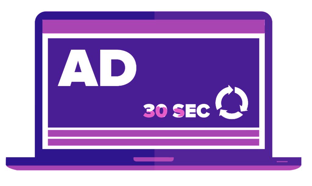
Ad Refresh for Banners

Banner ad refresh is an AdOps tactic where the ads displayed on a website are automatically updated or replaced with new ads after a certain period or following specific user actions, without needing to refresh the entire webpage. This strategy is employed to keep the ads engaging for the site’s visitors and to potentially increase the revenue for publishers.
By refreshing ads, publishers can ensure that the audience is exposed to more advertisements, thereby increasing the chances of clicks and impressions. This not only enhances engagement by presenting fresh ads to the audience but also optimizes inventory utilization, leading to higher revenue potential.
The refresh rate and triggers should be chosen carefully to balance increased ad exposure with the risk of annoying users or diluting ad effectiveness. For example, refreshing ads based on time spent on the page or after significant interaction events (like completing a video) can be more user-friendly and effective than indiscriminate refreshes.
Maximizing Banner Revenue with Header Bidding: Strategic Layout Insights

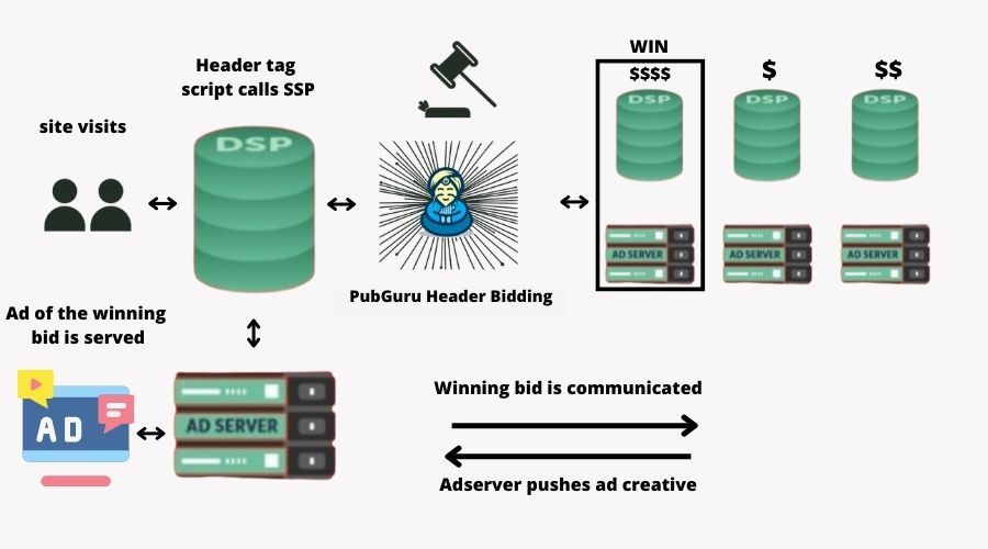
Integrating header bidding into your digital strategy not only optimizes your ad revenue but also necessitates a reevaluation of your site’s banner layout for maximum efficiency. This advanced programmatic advertising technique allows multiple ad exchanges to bid on your inventory simultaneously, ensuring you get the best price for each ad slot. However, its effectiveness is closely tied to the strategic placement of these ad units within your site’s layout. This interconnection between header bidding and layout adjustments is pivotal for publishers aiming to enhance their banner revenue.
Header Bidding and Banner Layout Optimization
While header bidding itself is a behind-the-scenes technology focused on maximizing ad revenue through real-time bidding, it has a significant impact on the optimal placement of banner ads on your site. The core reason for this is the algorithmic preference for ads that are not only high-value but also highly viewable. As such, ad units placed in areas of your site with high visibility and engagement rates are more likely to attract competitive bids. Get started with header bidding here.
Why Layout Matters in the Header Bidding World?
The integration of header bidding shifts the focus toward balancing high bids with high viewability. An ad slot located below the fold, for example, might traditionally be considered less valuable. However, in the context of header bidding, if your site analytics show a high engagement rate and deep scroll depth, this position could become highly lucrative. Advertisers are willing to pay more for ad slots that are actually seen and engaged with by users, making the strategic placement of these units more crucial than ever.
Maximizing Revenue with Layout Adjustments:
- Prioritize Visibility: In the era of header bidding, the placement of ads should be more aligned with user attention patterns. High-visibility areas—above the fold, near high-engagement content, or within articles—can significantly increase the chances of your ad units being the winning bid.
- Lazy Loading and Header Bidding: Implementing lazy loading—the technique of loading content as the user scrolls—must be carefully managed. Ads that load too early or too late can affect fill rates and overall revenue. Aligning lazy loading with user engagement data ensures that ads are served at the optimal moment for both visibility and site performance.
- Leverage Data for Layout Optimization: Header bidding offers a wealth of data on how different ad units perform across your site. Use this data to continually refine your ad placement strategy, focusing on areas that offer the highest yield. This might mean adjusting the size, position, or even the number of ads based on real-time performance metrics.
The key is to remain adaptable, leveraging data to inform continuous layout optimizations that meet the evolving demands of advertisers and the behavior patterns of your audience.
Simple Ad Layout (e.g. nytimes.com)
Last but not least, is the simple ad layout. This design appeals to every reader, is clutter-free, and is attractive without being an eyesore.
So to answer the question, how do you know the best strategies on ad placements that would give you more revenue? The answer ultimately depends on how you view your website’s functionality. Different strokes for different folks. In the end, you should always think of the best user experience — their clicks and behavior directly translate to your revenue.
MonetizeMore is a Google Certified Publisher Partner and an industry leader in Ad Optimization. Want to take your ad revenue to the next level? Sign up for a Starter account at MonetizeMore today!
Related Reads:
source https://www.monetizemore.com/blog/banner-layout-cheat-sheet-top-banner-placements-work/


0 Comments