The best ad placements always have two things in common: visitors are able to see the ads clearly and they aren’t annoyed by them. Today, we’ll give you the best ad placements in 2024, but please be mindful that these techniques aren’t set in stone. We still encourage you to experiment depending on your site’s functionality and which placements translate into the highest revenues. While in past articles, we’ve suggested some banner placements that will work on your site, in this article, we discuss valuable techniques as you start your ad-revenue stream. First, we’ll give you some tips to consider:
Psychology
There is a psychology behind how AdSense viewers respond to ads. Viewer’s responses depend on impulse and the information that they need. Impulsive clickers are those who have a low attention span and click AdSense ads out of compulsion. Semi-impulsive clickers, on the other hand, are information seekers and tend to click AdSense ads midway through an article. The third type of ad clicker is one who would prefer to click an ad after completing an article. Which categories do you believe your viewers would fit into?
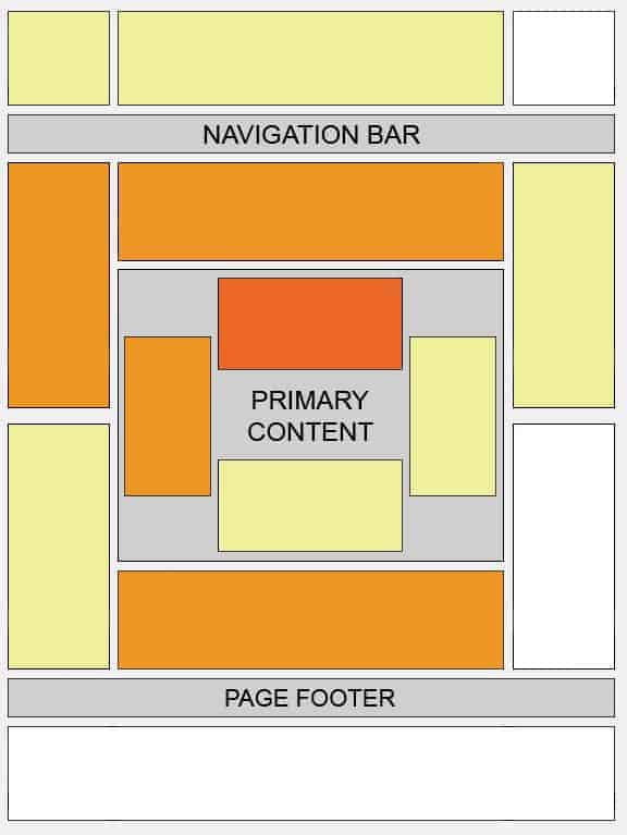
AdSense Heatmap Image
Remember the F- pattern on the previous blog? That is an analysis from the AdSense heat map imaging. Here is an image of Google’s recommendation Adsense ad placement recommendations.

Caption: Orange areas – strongest and maximum clicks; Light yellow areas receive the weakest and minimum clicks ( The darker the area, the higher the click rate).
Current top-performing AdSense placements
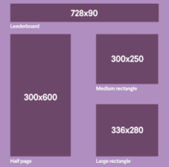
Best Desktop AdSense Placements

- 728×90 leaderboard – One of the best-performing AdSense banner sizes due to its size and prominent placement above the fold.
- 300×600 half-page – A large, high-visibility ad unit that performs well on desktop.
- 336×280 large rectangle – Another top-performing desktop ad size with good visibility.
- 300×250 medium rectangle – A versatile ad size that works well in various desktop placements.
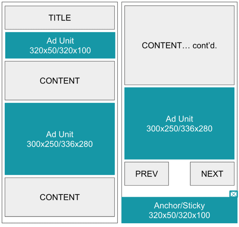
Best Mobile AdSense Placements

Mobile Leaderboard (320×50)
The 320×50 mobile leaderboard is considered one of the top-performing mobile ad sizes. It is a mobile-optimized banner that works well as a large ad unit, especially when displayed at the bottom of the page.
Mobile Medium Rectangle (300×250)
The 300×250 mobile medium rectangle, also known as a content ad, is placed within the content. This format achieves a strong impact by being close to the content and allowing users to interact easily with the ad.
Large Mobile Banner (320×100)
The 320×100 large mobile banner, although not officially part of the IAB standard sizes, is one of the top-performing mobile ad formats. It is a larger version of the 320×50 mobile leaderboard.
Mobile-optimized ad sizes like the 320×50 leaderboard and 300×250 medium rectangle are best for maximizing AdSense revenue on mobile devices in 2024. Factors like increased mobile usage and the need for less intrusive ad placements have made these mobile-first ad formats some of the top performers.
Test and optimize your mobile ad placements to find the right balance between revenue and user experience!
Google’s Requirements and Policies
- Display a maximum of 3 ad units, 3 link units and 2 search boxes on a single page.
- Avoid misleading placements, accidental clicks, misleading labels, misleading to clicks and everything that is included here: AdSense Ad placement policies
Related Read: Top AdSense Ad Violations
With these considerations, we may suggest you these ad placement tactics as you begin with AdSense this year:
1) Your safest bet? Base your ad placement on Google’s heat map. There is no harm in testing it out and having your ads placed on the areas that are best described in the image.
2) Your best-performing ad units. Place them above the fold BUT do not place too many that your content is already pushed below the fold because of your ads.
3) Ads in the middle. You may text wrap or not text wrap. Your call. As long as you have ads in the middle of an article or content. As you can see on the heat map, the orange and dark orange areas draw more clicks. Since they are above the fold, you may attract your impulsive and semi-impulsive clickers.
Related Read: Engage and Monetize: How to Win Readers’ Attention while Earning from Ads
4) The Uncommons. They aren’t your common ad sizes. They jump out of the page and can easily be seen. If that’s the case, those receive easy clicks.
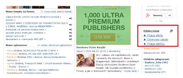
5) Link units. They do not look like typical ads. Though they work best to cater to your semi-impulsive and information-seeking viewers, you may still want to experiment. On the heat map, it is the orange area below the fold.
6) Custom Search. This is an additional revenue stream for publishers. AdSense ads can be above or right of the search results. Even if your query does not match, AdSense ads are also displayed.
Having these placements and best positioning is one thing but analyzing your numbers is another. Increase in your click-throughs and cost per mille can still be tweaked and analyzed giving the maximum potential for your ads to earn. Let us help you optimize those ads, whether it be from AdSense, Ad Exchange, or third-party networks.
Related Read: 5 Ad Optimization Experiments that You Should Try
Related Reads:
- Banner Layout Cheat Sheet: Top Banner Placements that Work!
- 5 Ad Optimization Experiments that You Should Try
- Engage and Monetize: How to Win Readers’ Attention while Earning from Ads
- Best AdSense Alternatives
source https://www.monetizemore.com/blog/best-adsense-placements/


0 Comments