Google’s long-awaited shift to mobile-first indexing is now a reality. As of July 5th, 2024, if your site is inaccessible on mobile devices, Google will not index it. This significant change underscores the importance of ensuring your website is crawlable and user-friendly on mobile devices.
- With mobile-first indexing, Google’s web crawler prioritizes indexing the mobile version of a website’s content over its desktop counterpart, which informs rankings.
- Google predominantly uses the mobile version of a site’s content, crawled with the smartphone agent, for indexing and ranking.
- You can check if you’ve moved to mobile-first indexing in Google Search Console. The URL inspection tool will identify which user-agent is used for crawling, such as Googlebot smartphone.

Top Tools for Testing Mobile Usability
Use these tools to fix any issues that might hinder your site’s mobile performance and usability before July 5th:
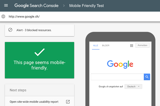
1-Google’s Mobile-Friendly Test: This is the most straightforward tool to use. Simply enter your site’s URL, and Google will assess its mobile-friendliness and provide a report.

2-BrowserStack: This tool lets you test your website across a wide range of real mobile devices, browsers, and operating systems. You can see exactly how your site looks and functions on various mobile devices.

3-mobiReady: This tool offers a comprehensive analysis of your site’s mobile readiness. It provides scores for various aspects of mobile optimization, along with suggestions for improvement.

4-Mobile Moxie: This tool provides a detailed analysis of your site’s mobile performance and usability. It offers both free and paid versions, with the paid version providing more in-depth insights.

5-GTmetrix: While primarily a performance testing tool, GTmetrix also provides insights into the mobile-friendliness of your site. It analyzes factors like mobile responsiveness and resource optimization.

6-Responsive Design Checker: This simple tool lets you preview your website on different screen sizes to ensure its responsiveness. It’s a quick way to check if your design adapts well to various mobile devices.

How can I Test if my Website is Fully Responsive?
To test if your website is fully responsive, you can follow these steps:
- Use Browser Developer Tools: Chrome Developer Tools, for example, allow you to simulate different screen sizes and orientations to test your website’s responsiveness.
- Test on Real Devices: Test your website on real mobile devices and tablets to ensure it adapts correctly to different screen sizes and orientations.
- Check for Consistency: Ensure that your website’s layout, content, and navigation are consistent across different devices and screen sizes.
- Test for Mobile-First Indexing: Ensure that your website is optimized for mobile-first indexing by testing how it appears on mobile devices and how it adapts to different screen sizes and orientations.
- Check for Cross-Browser Compatibility: Test your website on different browsers and devices to ensure that it is cross-browser compatible and responsive across different platforms.
- Use Automated Testing Tools: Tools like Testsigma and LambdaTest provide automated testing capabilities that can help you test your website’s responsiveness across a wide range of devices and browsers.
Best Practices for Mobile-First Indexing
By following these best practices, you can ensure that your site is mobile-friendly, user-friendly, and optimized for mobile-first indexing, which is now the standard practice for search engines:
Consistent User Experience
Ensure that the mobile version of your site aligns with the desktop version for optimal indexing and user satisfaction. Prioritize a unified experience that adapts to different devices, enhancing accessibility and appeal to a diverse audience.
Mobile-Friendly Copy
Craft your website with mobile-friendly precision by using shorter paragraphs, concise sentences, and legible fonts that enhance readability. Avoid user experience pitfalls by ensuring that your visitors can seamlessly navigate and engage with your content on mobile devices.
Structured Data Alignment:
Ensure that structured data remains consistent across different versions of your site to guide search engines through the intricate details of your web content. This enhances the accuracy of search engine indexing and contributes to a more cohesive online presence.
Create a Mobile-Friendly Website:
Use responsive design to ensure that your site adapts to different screen sizes. Optimize for page speed on mobile devices.
Test and monitor your site for errors and optimize for mobile SERPs. Don’t forget to avoid intrusive interstitials.
Mobile SEO
Focus on aspects of the mobile user experience, such as page load time, mobile responsive design, and mobile usability. Sites with a seamless mobile experience are more likely to rank higher in search results.
Get your free Mobile Ad Optimization Ebook here!
Best mobile-friendly ad sizes for easy mobile-first indexing

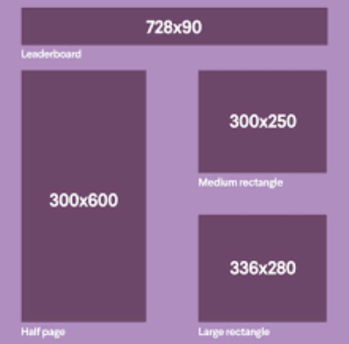
- 300×250 Medium Rectangle:
- One of the most popular and frequently used mobile ad sizes.
- Ideal for accommodating various ad creatives and ad types.
- Performs well on top advertising platforms and networks.
- 320×50 Mobile Leaderboard:
- Also known as “mobile banner”, it fits larger mobile phone screens at the top or bottom.
- Designed to fit the width of mobile screens.
- Commonly used as a mobile anchor ad with high viewability.
- 336×280 Large Rectangle:
- Similar in size to the 300×250 medium rectangle.
- Works best when placed between paragraphs or at the end of an article.
- Supported by major SSPs like Google AdX, Magnite, and AdForm.
- 320×100 Large Mobile Leaderboard:
- Twice the height of the standard mobile leaderboard.
- Performs well across mobile devices and has a high viewability rate.
- 300×600 Double Rectangle (Half Page):
- Covers most of the mobile screen, guaranteeing user attention.
- Ideal for interstitials and full-screen mobile ads.
Conclusion
The shift to mobile-first indexing is a significant change that requires publishers to prioritize mobile accessibility. By ensuring your site is crawlable and user-friendly on mobile devices, you can avoid indexing issues and maintain a strong online presence. Don’t wait until it’s too late; take action now to ensure your site is mobile-friendly and ready for the July 5th deadline.
Ready to 10X your mobile ad revenue? Get started here!
source https://www.monetizemore.com/blog/mobile-first-indexing/


0 Comments