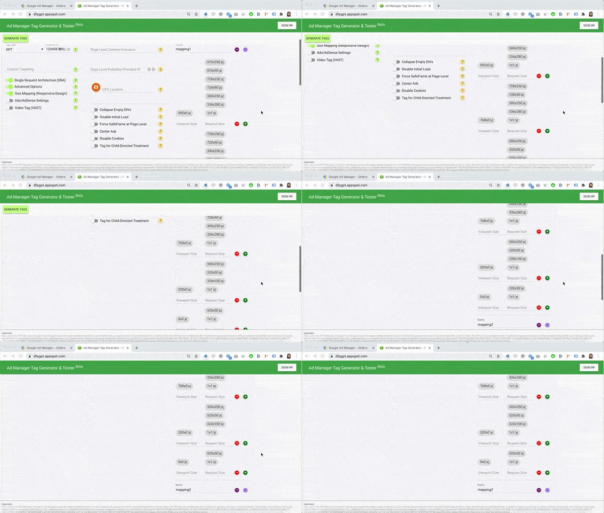
“Responsive” means the ad unit adapts automatically to the device where it’s being served. For example, ad_top_atf serves as either a 970×90/728×90 ad unit on desktop and transforms into a 300×250/320×50 on mobile. AdSense has this option when choosing the Ad Unit size, which they call a “responsive” size. If you use Google Ad Manager tags and want to do the same, you may do Size Mapping.
Google Ad Manager can handle the responsive behavior of the ad units by using Size Mapping. This gives publishers assurance that only appropriate sizes can be served depending on the device a visitor is using. In the old days, we used to insert codes manually, which was prone to many human errors, just to run Size Mapping for responsive ads. Now, you fill in the values using Ad Manager Tag Generator & Tester, and the tool generates the codes for you.
Let’s look at how to set it up below:
Size Mapping Setup Part 1
Step 1: Set the viewport minimum widths (in pixels) you will follow. Example:
| Device | Minimum Width |
| Desktop | 992 px |
| Tablet | 768 px |
| Mobile | 320 px |
| Other | 0 px |
Step 2: Decide on how many Size Maps you need. Depending on your site layout, you can set one Size Map that can be applied to multiple locations or spots. Here’s an example:
(top)
Mapping 1:
992×0 – 970×250, 970×90, 728×250, 728×90, 300×250, 336×280, 1×1
768×0 – 728×250, 728×90, 300×250, 336×280, 1×1
320×0 – 300×250, 320×50, 320×100, 1×1
0x0 – 320×50, 1×1
(sidebar)
Mapping 2:
992×0 – 300×600, 300×250, 336×280, 160×600, 1×1
768×0 – 300×250, 336×280, 160×600, 1×1
320×0 – 300×250, 320×50, 320×100, 1×1
0x0 – 320×50, 1×1
(mid-content)
Mapping 3:
992×0 – 728×250, 728×90, 468×60, 300×250, 336×280, 1×1
768×0 – 728×250, 728×90, 300×250, 336×280, 1×1
320×0 – 300×250, 320×50, 320×100, 1×1
0x0 – 320×50, 1×1
Here’s what it means: look at mapping 1 (top).
- If the device is at least 992px wide, regardless of the height, these are the sizes eligible to serve: 970×250, 970×90, 728×250, 728×90, 300×250, 336×280, 1×1
- If the device is at least 768px wide but less than 992px, regardless of the height, these are the sizes eligible to serve: 728×250, 728×90, 300×250, 336×280, 1×1
- If the device is at least 320px wide but less than 768px, regardless of the height, these are the sizes eligible to serve: 300×250, 320×50, 320×100, 1×1
- For any device smaller than 320px wide, these are the sizes eligible to serve: 320×50, 1×1
We are setting up another Size Map for the sidebar and middle because certain sizes are inappropriate for those spots. For example, you can’t serve a 300×600 in the middle of the page and can’t do 728×90 on the sidebar. Therefore, you need to declare which sizes are appropriate.
Feel free to create as many Size Maps as necessary. You can also re-use the same Size Map for multiple ad units, where applicable. For example, if you run three different ad units mid-content, you can assign the same Size Map for those three ad slots so they follow the same set of rules.
Size Mapping Setup Part 2
#1 – Configure your Ad Units in Google Ad Manager (GAM)
#2 – Log in to https://dfpgpt.appspot.com/
#3 – Insert your GAM network ID

#4 – Turn on Advanced Options

#5 – Turn on Size Mapping (Responsive Design)

#6 – Add the minimum viewport size and the corresponding eligible sizes, based on the Size Maps you have prepared.

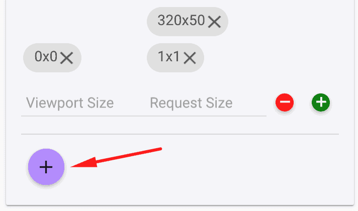
#7 – Repeat for the rest of the Size Maps

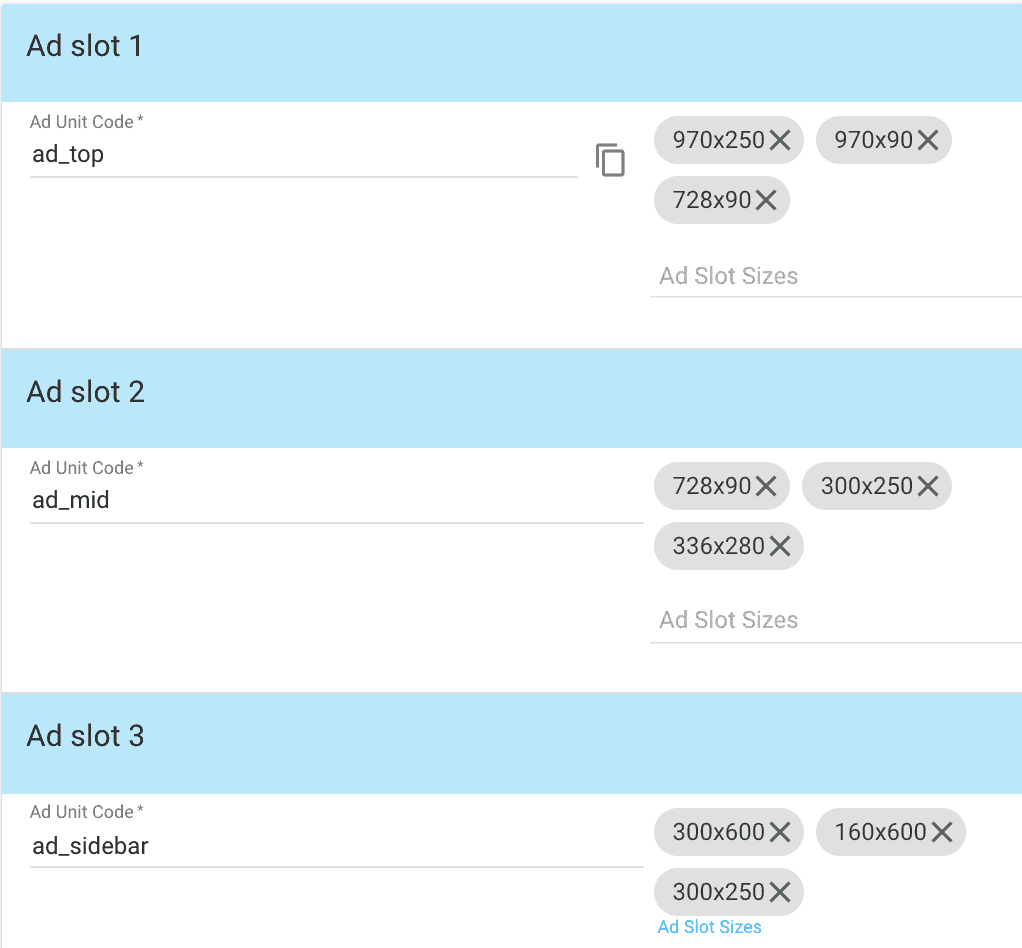
#8 – Add the ad units and corresponding ad sizes as configured in Google Ad Manager.

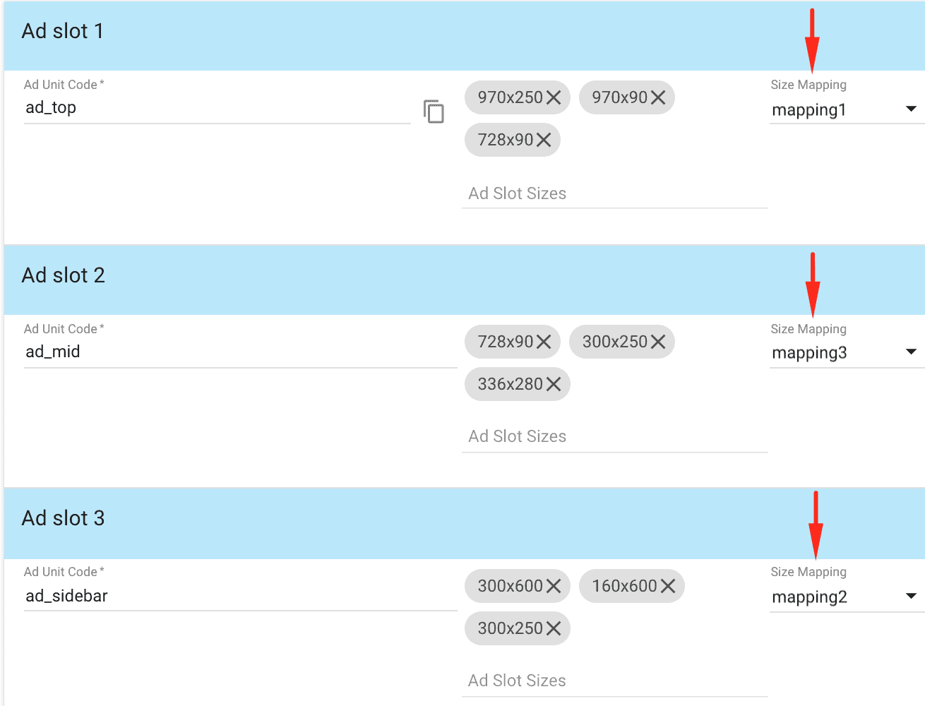
#9 – Select the Size Mapping that will apply to each Ad Unit

#10 – Repeat for the rest of the Ad Units and click Generate Tags

Deploy the Header tag to the <head> section of your site’s HTML and the Body tags into the <body> section. If you’re using WordPress, choose the free Advanced Ads plugin that allows you to manage and deliver ads efficiently.
While size mapping is a great option for making your ad units responsive, it’s not the only method. You can also use Line Item targeting to achieve responsive ads.
However, relying on the browser’s screen width to determine ad sizes is prone to miscalculations since the available space is often narrower than the full screen, especially on desktop devices.
To solve this, Advanced Ads provides an automated Google Ad Manager integration that adjusts ads based on the actual available space, ensuring they always fit perfectly without touching any code.
Best Tactics for Size Mapping Responsive Ads on Desktop and Mobile
Size mapping responsive ads effectively ensures that your ads are displayed in the most optimal size for different screen dimensions. Here are some best practices:
1. Prioritize Mobile-First:
- Mobile-Friendly Design: Ensure your ads are designed with mobile users in mind, as the majority of internet traffic now originates from mobile devices.
- Responsive Design: Use responsive design principles to allow your ads to adapt seamlessly to various screen sizes and orientations.
2. Define Key Breakpoints:
- Identify Critical Sizes: Determine the key breakpoints (screen widths) where you want your ads to change size. Consider factors like common screen sizes, ad unit dimensions, and content layout.
- Create Size Mappings: For each breakpoint, define the corresponding ad sizes you want to display.
3. Use a Flexible Ad Format:
- Fluid Layouts: Opt for flexible ad formats that can adjust their dimensions to fit different screen sizes without compromising the user experience.
- Responsive Ad Units: Leverage responsive ad units provided by your ad server or ad network, which automatically adjust their size based on the available space.
4. Consider Ad Unit Dimensions:
- Common Sizes: Use common ad unit dimensions (e.g., 300×250, 728×90) as a starting point, but be prepared to adjust them based on your specific needs and testing results.
- Experimentation: Test different ad sizes to see which ones perform best on different devices and screen sizes.
5. Optimize for User Experience:
- Avoid Intrusive Ads: Ensure your ads do not disrupt the user experience by taking up too much screen space or appearing unexpectedly.
- Ad Placement: Carefully consider where to place your ads on the page to avoid obstructing content or interfering with user navigation.
6. Test Across Devices:
- Thorough Testing: Test your responsive ads on a variety of devices and screen sizes to ensure they display correctly and perform as expected.
- User Feedback: Gather feedback from users to identify any issues or areas for improvement.
7. Utilize Ad Server Features:
- Responsive Ad Units: If your ad server supports responsive ad units, leverage this functionality to simplify the size mapping process.
- Dynamic Creative Optimization (DCO): Consider using DCO to automatically adjust your ad creative based on factors like device type, location, and user behavior.
Still struggling with Size Mapping? How about ad optimization? Are you reaching the ad revenue levels you want? MonetizeMore has a way for you to scale your ad revenue optimization sustainably. Get started here!
source https://www.monetizemore.com/blog/size-mapping-responsive-ads-gam-tag-generator-tester/


0 Comments